A LinkedIn headshot that gets you taken seriously.
Free preview, no studio.
Profiles with a sharp headshot get noticed first. Upload a few selfies and PoseLab creates a polished, profile-ready headshot from your own face — no card needed to preview. Love it? Unlock the full gallery in about 25 minutes.
Free preview · Photos deleted in 30 days · 14-day money-back guarantee
The hard part is making it still look like you.
Your selfies guide the AI, so the result keeps your real face — not a generic AI stranger. Here's our founder: a phone selfie on the left, PoseLab on the right. Same person, about 25 minutes apart.
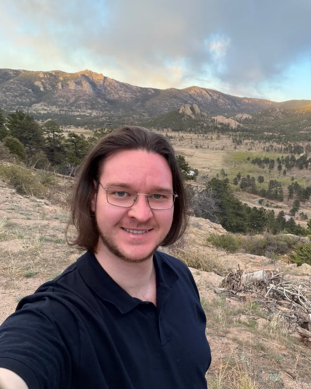
Phone selfie
No lighting. No retouch.
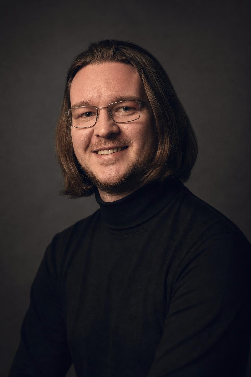
PoseLab
Same face. About 25 minutes later.
Built by someone who uses it
PoseLab is run by its founder — the headshot above is his own. If it didn't work on his face, this page wouldn't exist.
A real person answers
No support maze or chatbot. Every email goes to a real inbox, usually answered within a day.
Nothing to lose
See a free preview on your own face before paying, and every paid tier is backed by a 14-day money-back guarantee.
How AI headshots work. No shoot day.
01
Upload 3–20 selfies
Front-facing, varied outfits and lighting. No sunglasses or group shots. The more variety you give us, the better the AI can work with your features. Takes about a minute from your phone.
02
We create from your references
Your selfies guide the AI so each portrait still looks like you, not a generic AI face. We create all styles at once and typically wrap in about 25 minutes.
03
Download your headshots
You'll get an email with a link to your private gallery the moment it's ready. Filter by style, mark your favorites, and grab a ZIP of the full set. Your gallery stays active for 30 days.
Ten AI headshot styles. One polished gallery.
Five core styles in every tier. Five more exclusive to Premium.
Every image below was generated by PoseLab — not stock photography.
Core — included in every tier
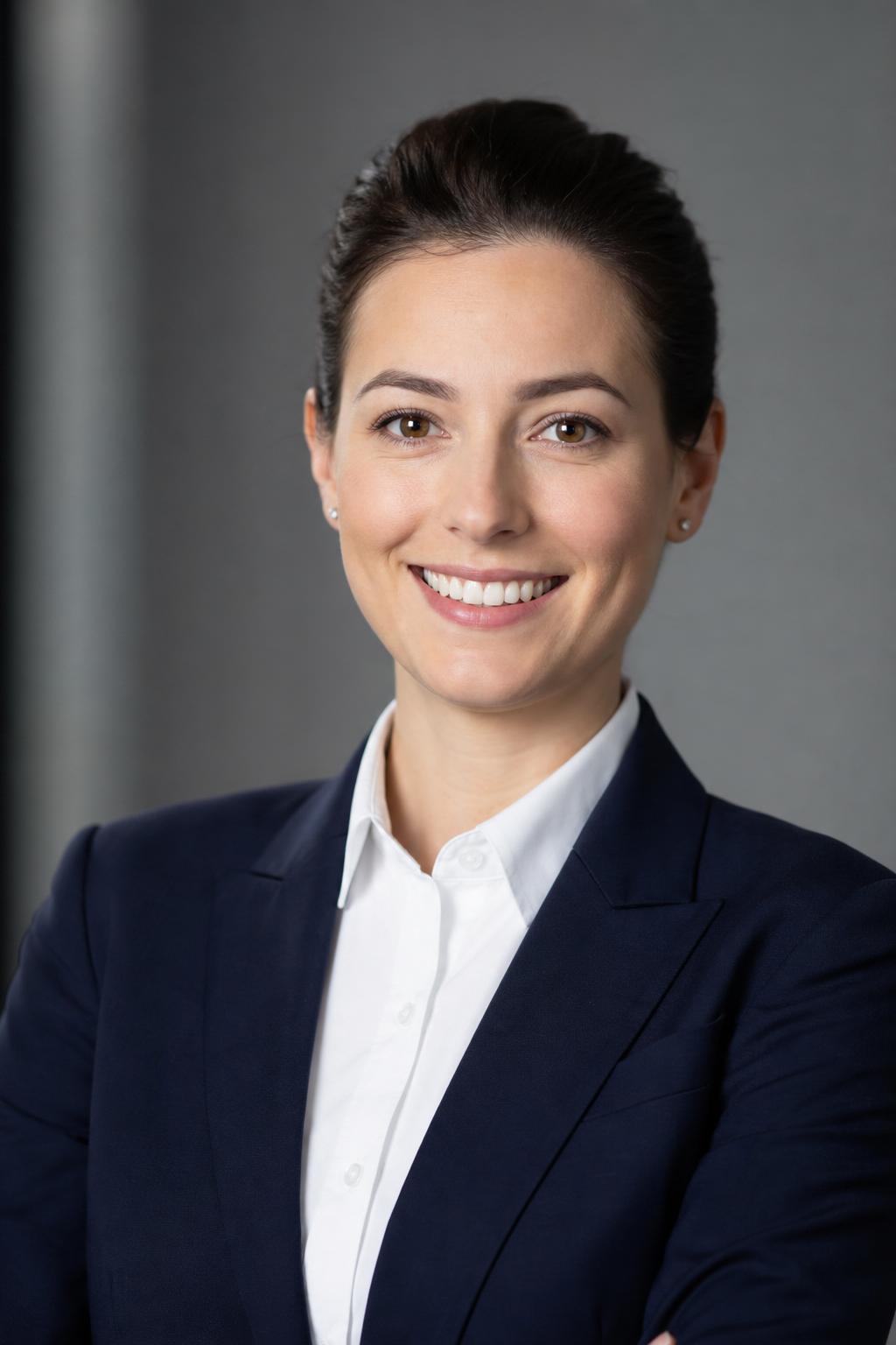
Corporate
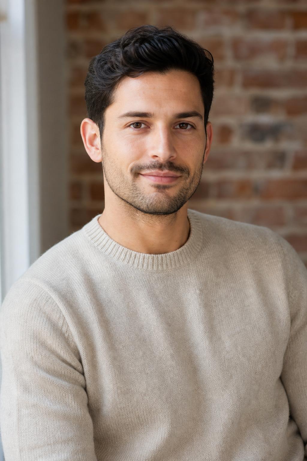
Startup
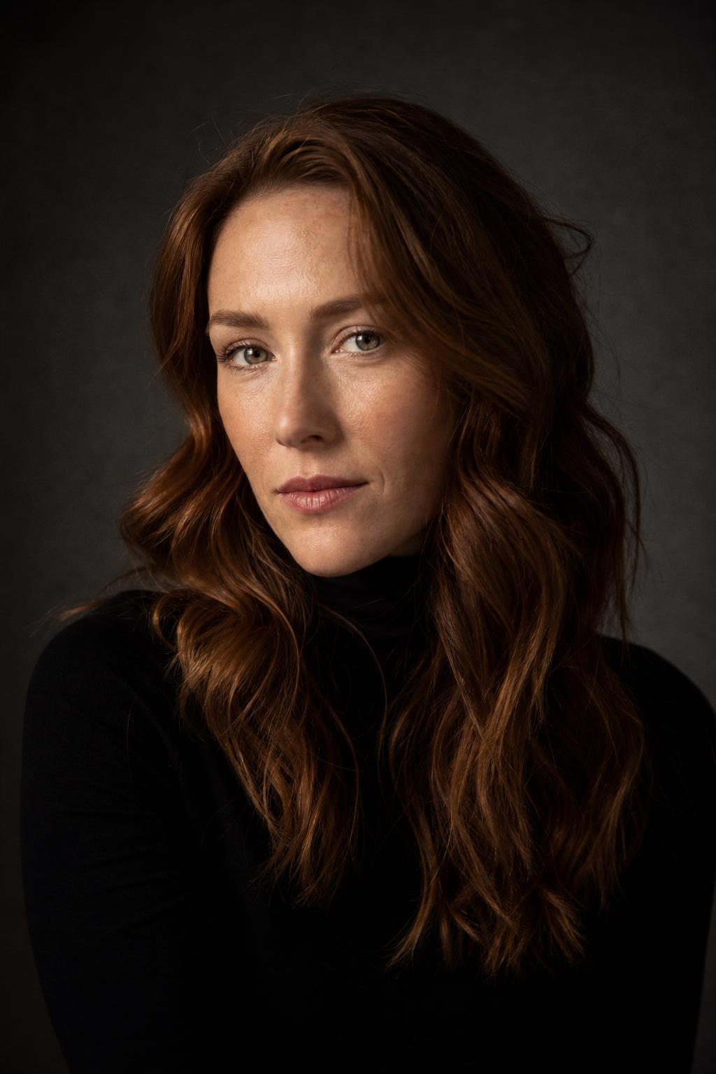
Creative
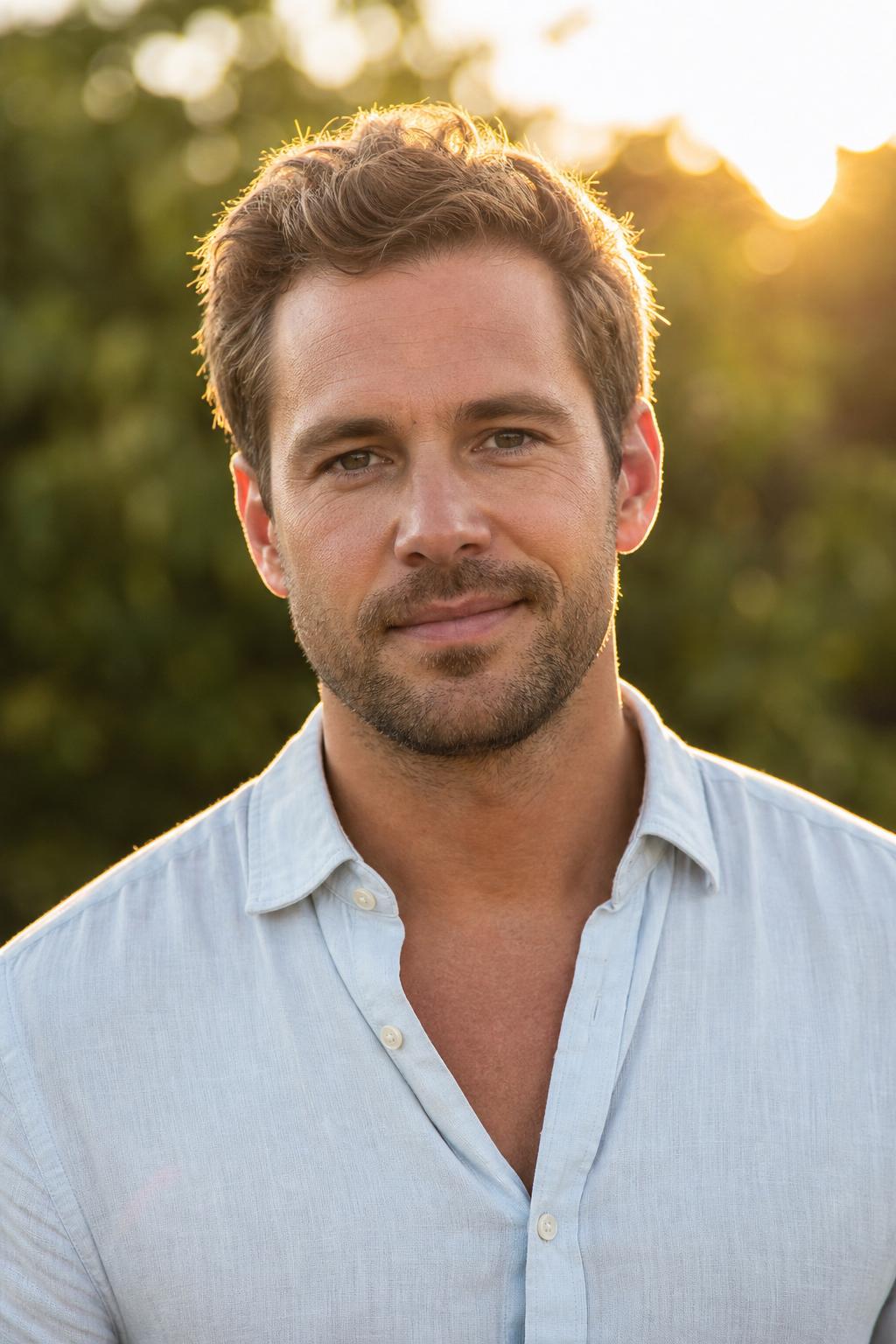
Outdoor
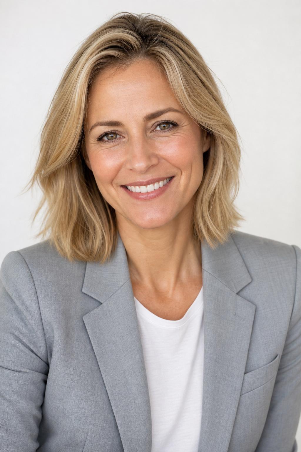
Friendly
Premium exclusive
Premium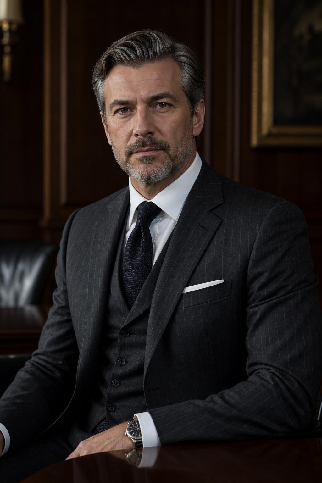
Executive
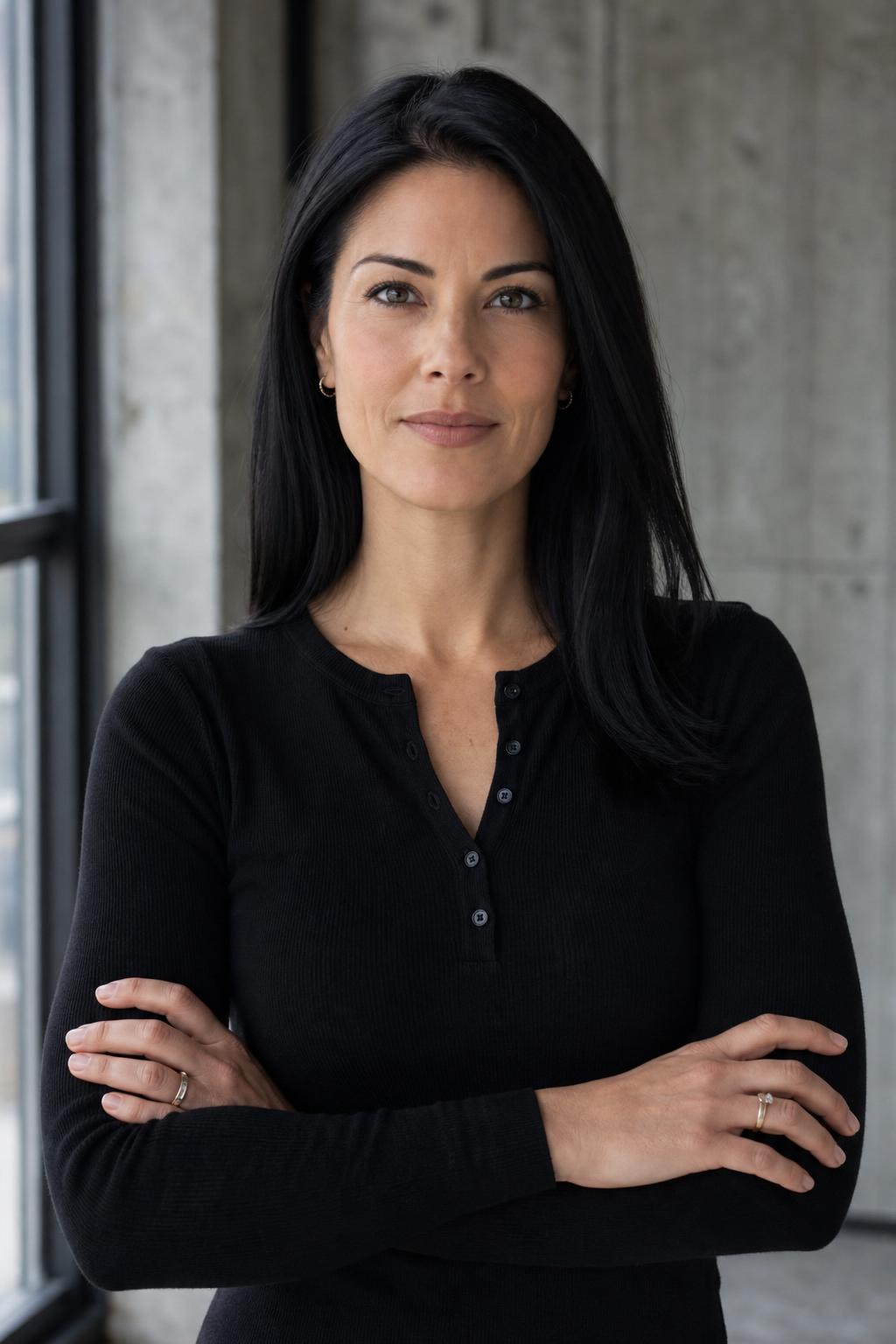
Founder
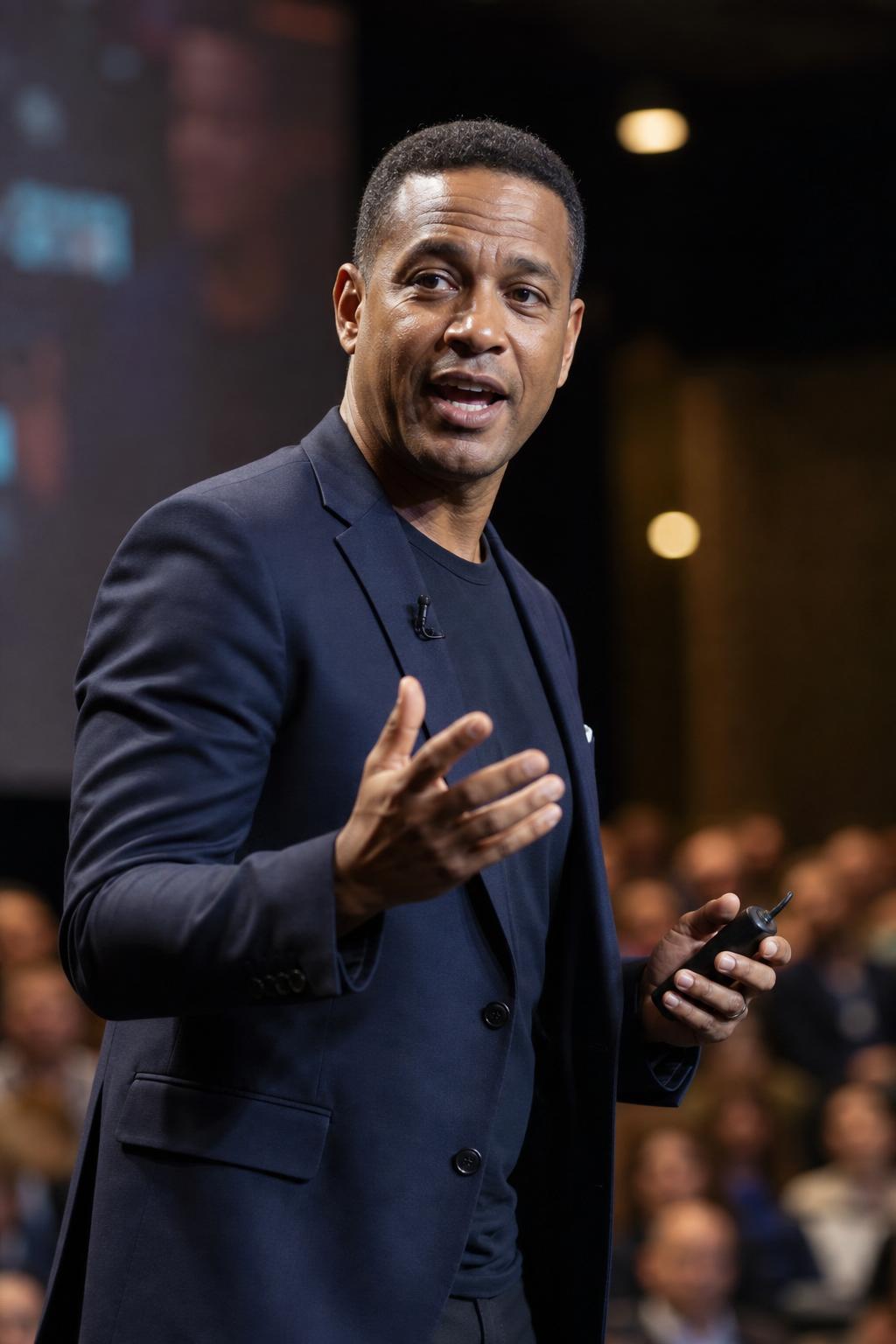
Speaker
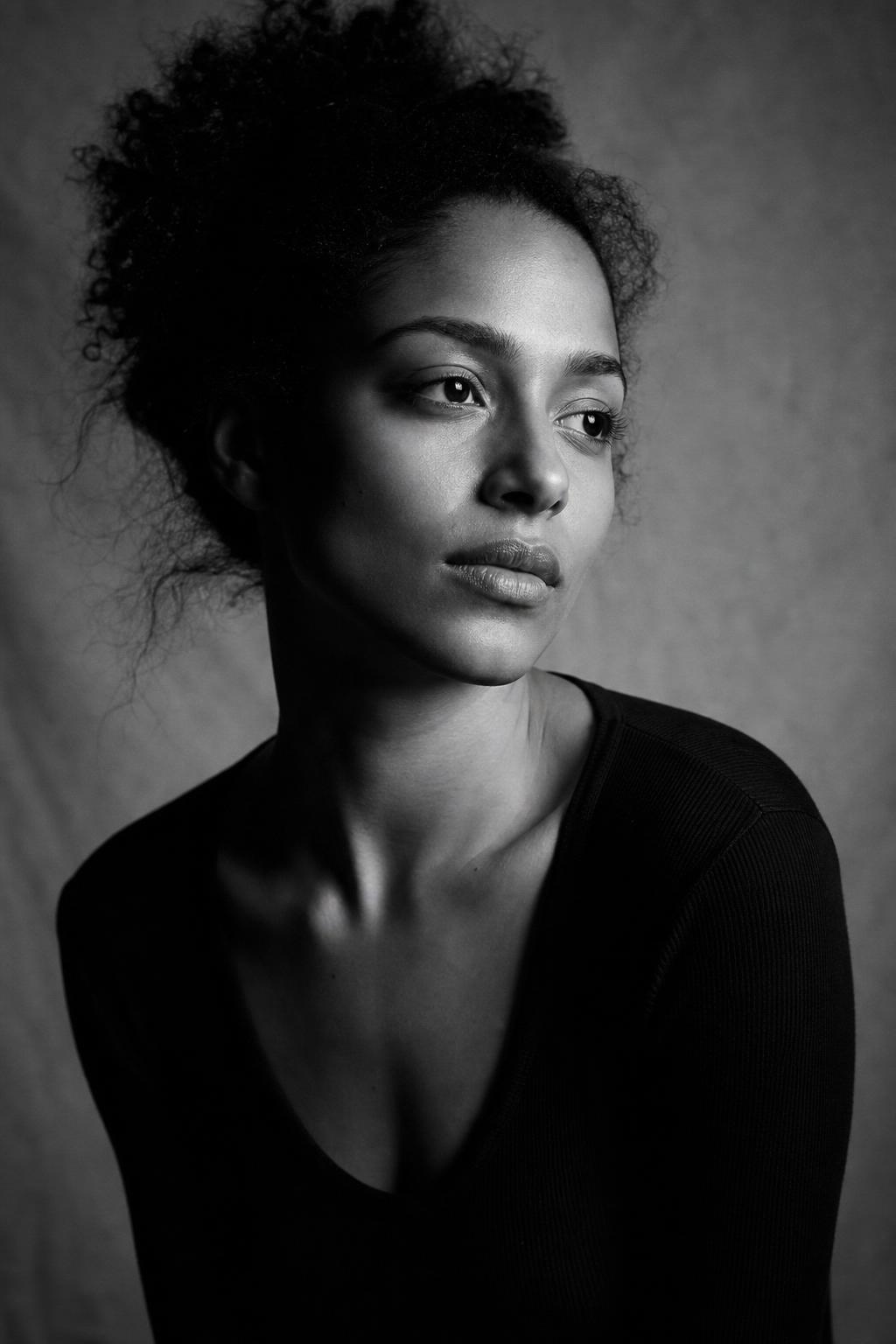
Editorial B&W
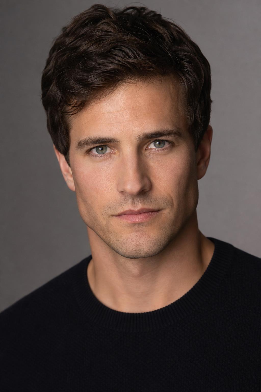
Actor
AI headshots vs. a professional photographer. Without the studio.
Professional photographers charge $200–$1,000+ for a single session. PoseLab delivers polished AI headshots from photos already on your phone — for a fraction of the cost.
No studio, no scheduling
Upload from anywhere, right now. No booking wait, no travel, no awkward direction from a stranger. Just upload your selfies and we handle the rest.
Looks like you — not generic AI
Your own selfies guide every portrait, so the results keep your face, skin tone, hair, and features — recognizably you, not a one-size-fits-all AI face.
Free retry guarantee
If any style misses the mark, email us within 14 days. We'll retry it with adjusted prompts at no charge. Still not satisfied? Full refund, no questions asked.
| PoseLab | Professional photographer | |
|---|---|---|
| Cost | $9.99 – $35 | $200 – $1,000+ |
| Turnaround | ~25 minutes | 1–2 weeks (booking + editing) |
| Where you need to be | Anywhere with your phone | At the studio |
| Number of looks | 5–10 styles per session | Usually 1–2 outfits |
| Retry if unhappy | Free retry within 14 days | Usually a paid reshoot |
| Commercial usage rights | Included | Varies by contract |
AI headshot pricing. No subscription.
Enter your email, check out with Stripe, and upload your photos right after.
Starter
$9.99
one-time$2.00 per headshot · $200+ studio session
- 5 professional headshots
- 5 curated styles
- Ready in about 25 minutes
- High-definition downloads
- Free retry guarantee
Secure Stripe checkout · 14-day money-back · photos deleted in 30 days
Pro
$19.99
one-time$1.00 per headshot · $200+ studio session
- 20 professional headshots
- 5 curated styles
- Ready in about 25 minutes
- High-definition downloads
- Free retry guarantee
Secure Stripe checkout · 14-day money-back · photos deleted in 30 days
Premium
$35
one-time$0.70 per headshot · $200+ studio session
- 50 professional headshots
- 10 curated styles
- Print-ready high-definition downloads
- Ready in about 25 minutes
- Free retry guarantee
Secure Stripe checkout · 14-day money-back · photos deleted in 30 days
All plans include a free retry guarantee. Refunds available within 14 days.
LinkedIn headshots — FAQ
Is the headshot the right shape for LinkedIn?+
Yes. Every style is shot shoulders-up with a clean background, so it crops cleanly into LinkedIn's circular profile photo and looks just as good on your banner or company team page.
Will recruiters be able to tell it's AI?+
The point is that it still looks like you — your selfies are the identity reference, so the result keeps your real face. It reads as a professional headshot, not an avatar. Use the free preview to judge for yourself before paying.
Is the free preview really free?+
Yes. One watermarked headshot per email address, no credit card required. You only pay if you like the result and decide to unlock the full gallery.
What if I don't like my preview?+
Don't pay. That's the whole point of the preview — you see exactly how PoseLab works on your face before spending a cent. If you don't upgrade, your photos and preview are deleted automatically after 7 days.
Why is the preview watermarked?+
Previews are watermarked so the free flow stays a preview. When you upgrade, the same image becomes part of your gallery without the watermark, alongside the rest of your headshots.
Will the headshots actually look like me?+
Yes — that's the core of how it works. Your input selfies act as identity references for the image model, so the generated faces inherit your real face, skin tone, hair, and features. The free preview lets you confirm this on your own face before paying.
How long until I get my headshots?+
Your free preview lands in about 60 seconds. After you upgrade, the full gallery is ready in about 25 minutes — emailed automatically.
What kind of photos should I upload?+
3–20 recent selfies or casual portraits. Vary your outfits, backgrounds, and lighting. Shoulders-up framing works best. Avoid sunglasses, hats, heavy filters, group shots, and photos more than a year or two old. The more variety you give us, the stronger your results.
Do you train AI models on my photos?+
No. Your selfies are sent to OpenAI's image-edit API as visual references for your order only. OpenAI says API data is not used to train or improve its models unless a customer explicitly opts in. We never train any model on your images.
What resolution and file format are the headshots?+
Starter and Pro deliver high-definition JPEGs — great for LinkedIn, company bios, and social. Premium delivers extra-large print-ready portraits (1152×2048) that hold up for printed materials too. Every image is downloadable individually or as a full batch ZIP straight from your gallery.
Can I use the headshots commercially?+
Yes. You own the generated images outright and can use them for any lawful purpose — LinkedIn profiles, agency bios, press kits, marketing materials, websites, and more. See our Terms of Service for the full licensing terms.
What changes between tiers?+
Every tier includes the five core professional styles (Corporate, Startup, Creative, Outdoor, Friendly). Pro adds more variations from that core set. Premium includes 10 styles total — the five core styles plus Executive, Founder, Speaker, Editorial B&W, and Actor — along with extra-large print-ready portraits.
What if I don't like the results?+
Email hello@poselab.io within 14 days. We'll first retry the style with tighter prompts at no charge. If the retry still misses the mark, we'll issue a full refund — no questions asked.
Do I need to create an account?+
No account needed. You pay via Stripe, then receive a unique upload link by email. Your gallery is accessible via a private link sent to the same address. No password, no signup.
Is my data safe?+
Your input selfies and generated headshots are stored encrypted on Cloudflare R2 and deleted automatically 30 days after delivery. We don't sell or share your images. You can request earlier deletion any time by emailing hello@poselab.io.
See yourself before you pay.
Upload 3–20 selfies. Get one watermarked headshot back in about 60 seconds. Pay only if you love it — and we'll refund within 14 days if you change your mind.
Free preview · No subscription · 14-day money-back guarantee